Colourful Conversations: The Intersection of Hue and Meaning

Colour: muddy
In our rapidly shifting, image-saturated world, it’s all too easy to glide over the surface of our experiences, reduced to mere abstractions — jargon, labels, and symbols that barely skim the depth of reality. We communicate in shorthand, relying on simplified terms and concepts that fail to capture the richness of our perceptions. Yet, what if we dared to delve deeper? What if we paused to explore the small windows of understanding that exist within these abstractions, allowing ourselves to transition from a realm of oversimplified ideas into the vibrant complexity of reality?

Color, for instance, is often relegated to basic categories — red, blue, green — an abstraction that glosses over the subtle gradations and emotional resonance inherent in each hue. But when we shift our focus to the variance within color, we open ourselves to a more profound experience. Every color holds a spectrum of meanings shaped by context, relationships, and perceptions. It is in these nuanced shifts, these small windows of difference, that we can truly engage with the world around us.
This journey from abstraction to reality is not just a philosophical exercise; it’s essential for authentic communication and understanding in our increasingly interconnected lives. By looking beyond superficial labels and exploring the intricate details of color — or any form of expression — we enrich our connections and foster deeper empathy. When we embrace the complexities and variances inherent in our perceptions, we empower ourselves to navigate the world with greater clarity and insight.
Let us step away from the shadows of abstraction and into the illuminating light of reality, where every detail matters, and every interaction can be a transformative experience. In doing so, we not only expand our understanding of color but also of language, relationships, and the very fabric of human connection. Through these small windows, we can glimpse a fuller, richer reality, allowing us to truly see, feel, and engage with the world around us.
When you look at a website, have you ever wondered why specific colours leap off the screen while others gently fade into the background? Or why does one site feel calm and serene while another feels chaotic and bold? It’s not just the subject matter — colour plays a pivotal role in shaping our perceptions, emotions, and interpretations. But colour, much like language, is not as straightforward as it seems.
Just as the words we use are influenced by context and meaning, the colours we see are shaped by their relationships with one another, the light they reflect, and the way our minds interpret them. This complexity, hidden beneath the surface of simple shades of red, blue, or green, makes the study of colour fascinating and essential.
Understanding the nuances of colour theory helps us see beyond the obvious and appreciate the subtle interplay between hue, value, and intensity. More importantly, as philosopher Alfred Korzybski emphasized in his work on General Semantics, how we categorize and name things often oversimplifies the rich reality beneath. Colours are not static — they shift and change based on context, like words in a conversation. And just as being aware of language’s complexity helps us communicate better, being mindful of the depth and variance in colour can help us create more powerful, meaningful communication.
Get Rob Gartner’s stories in your inbox
Join Medium for free to get updates from this writer.
In a world where visual communication surrounds us daily, from art to branding to social media, learning to “read” colour with the same attention to detail as we do language opens up a whole new level of understanding and creativity.
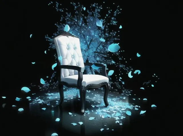
In colour theory, much like language, we often assume that concepts are fixed and easily understood. However, as Alfred Korzybski argued, the reality we perceive is not a direct reflection of the world but a simplified, abstract version filtered through our minds. Just as no two people will see or describe a “chair” in precisely the same way, no two artists will identically interpret colour. Colours are not static; they exist in a constant state of flux, shaped by the context in which they are placed and how they are perceived by the viewer.
In colour theory, we reduce the complexities of light and pigment into basic terms — hue, value, and intensity — to better understand how colours relate to one another. But Korzybski’s idea of abstraction reminds us that these categories, while useful, are merely conceptual maps, not the territory itself. For example, a “red” on a palette can be warm, cool, bright, muted, or anything in between, depending on how it is mixed, its surrounding colours, and the artist’s intent. Like language organizes our perceptions of reality, colour theory organizes our visual experiences. Still, it does not fully capture the depth and variance inherent in colour.
Korzybski’s principle of non-identity, the idea that no word or symbol is identical to what it represents, applies just as easily to art. When we talk about colours like red, blue, or green, we name abstract concepts, but the experience of those colours is always more complex than their labels. Colours are influenced by their relationships with one another — just as words gain meaning through their context — and their contrasts, harmonies, and intensities can change our perception of a painting’s mood, depth, or energy.
In art, just as in language, focusing on the variance within these abstract categories allows for more prosperous, more nuanced expression. Theories of hue, value, and intensity give artists a framework, but real creativity comes from breaking free of rigid definitions and embracing the unpredictable, evolving nature of colour. By recognizing that each colour exists not as a fixed entity but as a spectrum of possibilities, artists, like Korzybski’s semanticists, can explore deeper truths and create works that reflect the complexity of the world around us.
By focusing on the variance within colour, we move away from abstract representations and begin to see colour for what it truly is — an evolving, context-dependent experience. Hue, for instance, isn’t just a label like “yellow” or “blue.” Every hue contains countless subtle shifts that change depending on its surroundings. A yellow in isolation might feel bright and cheerful, but it can seem muted or even melancholic when placed next to a dark blue. This interaction of colours reveals the reality behind the abstraction, showing us how much more there is to colour than its theoretical definition.
Value, too, is more than just the scale from light to dark. How a colour’s value interacts with light in the real world can shift dramatically depending on texture, shadow, and reflection. A painting that captures these differences in value doesn’t just represent reality — it reflects it, creating a tangible sense of depth and atmosphere. Similarly, intensity or chroma isn’t just about the purity of a colour in a theoretical sense; in reality, intensity dictates how much a colour can dominate or recede within a composition. The abstract idea of a “bright colour” only comes to life when we see how it vibrates against duller hues in the real world.
Korzybski’s work reminds us that the abstractions we use — whether in language or colour theory — are tools to simplify reality, but they are not substitutes for reality itself. To truly engage with the power of colour, we must break free from rigid categories and embrace its variance. This means seeing beyond “red” or “blue” and exploring how these colours change, shift, and interact in the real world. Only then do we move from theory to practice, from abstraction to reality.
This shift is crucial in communication. When an artist paints, they aren’t just filling spaces with theoretical colours — they are capturing the fundamental, living interactions between light, pigment, and perception. The variance within each colour — its changing hue, evolving value, and fluctuating intensity — gives the work its emotional depth and visual complexity. This variance reflects the complexity of our world, offering a richer, more authentic connection to reality.
We unlock the depths of communication by recognizing that colours and words are more than abstract labels. In doing so, we engage with the full spectrum of reality, moving beyond the simplified maps of theory to the vibrant, dynamic territory of real-world perception.