Importance of White Space in UI Design

Every pixel counts in the world of user interface design, and white space is one of the most underappreciated but critical factors. White space, often known as negative space, is the empty space between and surrounding design features. While it may appear counterintuitive to leave areas of the screen “unused,” white space is not wasted.
Instead, it is a great tool for improving aesthetics, readability, and successful user navigation across a digital interface. White space is essential in every design arrangement.
It does not have to be ‘white’ this gap could be a distinct hue or texture that separates items together.
This blog will explore the significance of white space in UI design and how UI/UX design services & companies can use it effectively. We will explore why friction isn’t always a drawback White space is the silent hero of UI design, helping to increase readability, emphasize crucial items, and balance visual clutter. It is not only about what is brought to the screen but also what is purposefully left out.
White space can be classified into several types, each serving a distinct role in UI design
Micro White Space
This refers to the small gaps between individual UI elements, such as:
- The space between letters, lines of text, and paragraphs.
- Padding inside buttons or input fields.
- Margins between icons and labels.
Macro White Space
- The space between the header and the body text.
- Spaces between sections or blocks of information.
- The total margins around the main content area.
Active White Space
- To make a call-to-action button stand out, add space around it.
- Gaps are strategically designed to draw the user’s sight down a specific path.
Passive White Space
- To make a call-to-action button stand out, add space around it.
- Gaps are strategically designed to draw the user’s sight down a specific path.
- Three Elements to Consider When Designing Negative Space
Legibility
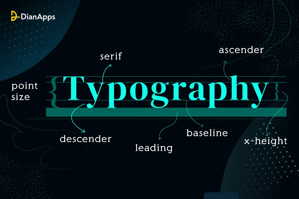
We saw that in order to make UI content readable, tiny white space is crucial. When deciding on design typography criteria, including font, size, color, style, leading, kerning, and tracking, designers should take white space into account. Do you recall the picture from the last page? The entire user experience and reading performance are impacted when the white space pattern is altered. Satisfied readers are much more inclined to stick with your page.
Branding and Design Tone
The general design’s tone is influenced by white space. Websites with more macro white space could be more luxurious and minimalistic. Websites that have less macro white space could seem more educational.
Concentration and Focus
The user can navigate interactive material more easily with the aid of white space. Creating emphasis points and drawing the user’s attention to particular layout elements may be beneficial. Prioritizing particular components or materials is a component of website strategy planning. Playing with the amount of white space surrounding these focus points is one of the various visual strategies you may employ to draw attention to particular aspects. This notion is used by the print and branding industries to highlight brand messaging.
Get DianApps Technologies’s stories in your inbox
Join Medium for free to get updates from this writer.
Suggested Read- Design for Fatigue
White Space In Action Examples
Google Search
One of the best examples in terms of using white space is Google’s homepage. With the design being minimalist, they drew users straight to the search bar making it less distracting and more functional.
Apple
Apple uses white space on its site to provide plenty of focus on its products, making sure each product gets the attention it needs. The generous spacing gives a sophisticated luxurious feel which works very well with the brand.
Medium
Medium, a writing and reading site, uses white space to help with legibility. Content has generous margins and line spacing that are easy on the eyes, encouraging users to stay engaged with the content.
The Influence of White Space on User Experience
Reduces Cognitive Load
The brains of users have to process everything that happens on a cluttered interface, becoming frustrated and leaving. When a screen is full of text, and buttons all around — it does require some effort to focus on what we intend to read first. White space cuts that cognitive load by giving out the information in an easily digestible manner along with ensuring no downtime in product interaction from the user.
Builds Trust
Minimize the use of color and try to be as clean as possible because designs that are squeaky clean look more professional and hence, appear more trustworthy (besides, people love white spaces). Habitual retention is more likely when users consider a product or service to be credible and of high quality.
Enhances Accessibility
Adequate space between elements allows better user interactions with the interface, specifically people who have motor problems or vision impairments. A regular white space ensures design accessibility; hence making the design open to all users.
White space may have its advantages, but it also has risks associated with it:
Wasted Space:
Based on the first reason, stakeholders may see white space as wasted space, and room to add even more content or features.
Finding the Right Amount of White Space:
An insufficient amount creates the impression of a congested page, but too much can render the design appear bare-bones or incomplete.
Responsive design:
Maintaining the same level of usability and effectiveness enabler role for whitespaces across devices with varying screen sizes necessitates planning, testing, measuring, and tweaking.
Educating stakeholders on the importance of white space and utilizing wireframes or prototypes can help to alleviate these issues.
Conclusion
The white space / empty canvas is more than a placeholder, it is a design feature that improves usability, aesthetics, and user satisfaction. White Space in UI Designing By strategically using white space, you can design your interfaces attractive, easy to navigate and more functional.
As digital products continue to change and evolve, white space will remain an important part of UI strategies. It links form and function and does not bombard the user with unnecessary information but it still makes the point the data on display. Use white space, and you’ll discover, sometimes, less is more.
Author Name:- Prachi Mathur
As a UI/UX Designer with a wealth of experience, I believe in crafting user-centric solutions that transcend technology. I am dedicated to using my skills to make a meaningful difference, enhancing both digital experiences and contributing positively to the world around us.