NMIX 6030: SwiftUI Final Project

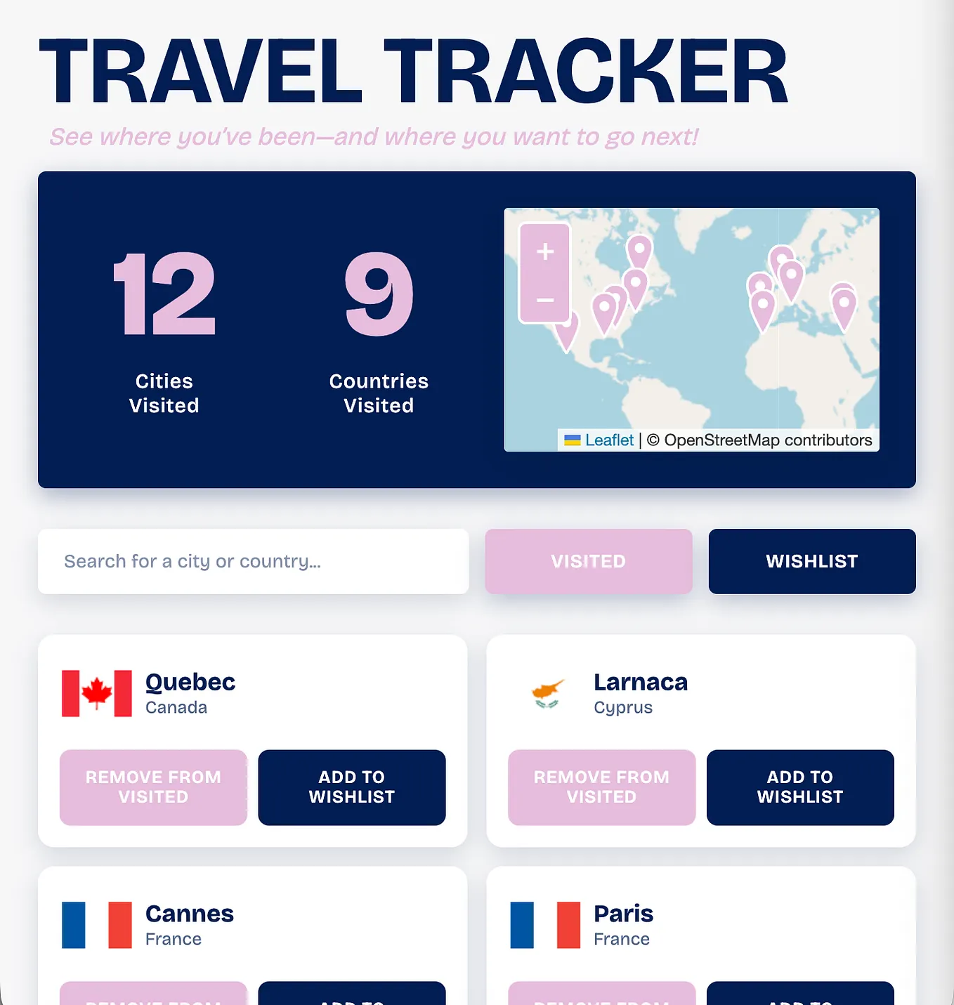
After working through smaller SwiftUI exercises earlier in the semester, this final project challenged me to bring everything together into one fully functioning native app. I decided to build Travel Tracker, an iOS app that lets users explore countries and keep track of where they’ve been and where they want to go.

I wanted something that felt both practical and visually engaging, so I focused on creating a clean, colorful interface paired with real-world data. Before diving into code, I outlined the core features I wanted the app to include:
- a browsable list of countries with flags and basic details
- the ability to mark countries as “Been” or “Wishlist”
- a search bar for quickly finding countries
- a simple filtering system to switch between saved states
- a detail view with more in-depth country information
From there, I started building out the app using SwiftUI and quickly realized how much this project would connect concepts that had previously felt separate.
Building the App
One of the most important parts of this project was working with real API data. I used the REST Countries API to fetch country information and FlagsAPI to fetch flags. Seeing that data flow from an API into my app and then into the UI made everything feel much more real compared to earlier projects.
On the UI side, I relied heavily on SwiftUI’s layout system, using stacks and navigation tools like NavigationStack and navigationDestination to structure the app. I also built lightweight reusable components, like the custom “Visited/Wishlist” bar, which helped keep the interface consistent and modular.
Get Emily Adamo’s stories in your inbox
Join Medium for free to get updates from this writer.
As I refined the design, I moved away from default components and started customizing more of the interface. I replaced the standard segmented picker with a fully custom filter bar, added a live counter for visited countries, and introduced a cohesive color palette with soft, rounded UI elements. Small details like spacing, border styling, and color consistency made a big difference in how polished the app felt by the end.

Iteration & Design Decisions
As the project evolved, I made several visual and functional updates to improve both usability and aesthetics. I shifted the app to a custom light pink background and built out a full color system to create a clearer visual hierarchy. I also restructured the layout into a more intentional flow — header, search, filter, then list — which made the app easier to navigate.
One particularly important change was switching to a different flags API after running into missing or broken flag images. While it seemed like a small detail at first, it had a big impact on the overall reliability and completeness of the app’s UI.

Challenges & Problem Solving
One of the biggest challenges I faced wasn’t just technical — it was working with limited access to AI tools during development. Early on, I relied on an LLM to help troubleshoot issues, but hitting usage limits forced me to slow down and rethink how I approached problems.
Instead of quickly iterating through multiple prompts, I had to be more intentional — planning out questions, debugging on my own, and leaning more on documentation. While this sometimes made the process slower, it ultimately helped me become more independent and confident in my problem-solving abilities.
There were also smaller technical challenges along the way, like managing state for filtering, ensuring UI updates happened correctly, and refining layout behavior. Each of these pushed me to better understand how SwiftUI handles data flow and rendering.
Results
By the end of the project, I had a fully functional app that successfully integrates real-time data, interactive UI elements, and a cohesive visual design. Users can browse countries, search in real time, mark places they’ve been, and filter their selections — all within a clean, responsive interface.
More importantly, this project marked a turning point in how I approach development. Concepts like networking, state management, and UI composition no longer feel disconnected — they now work together as part of a complete system.
I also noticed a big improvement in how I debug and work through problems compared to earlier in the semester. What once felt overwhelming now feels manageable, and I’m much more comfortable building and refining a full app from start to finish.