A Space of Your Own, Built in Chat

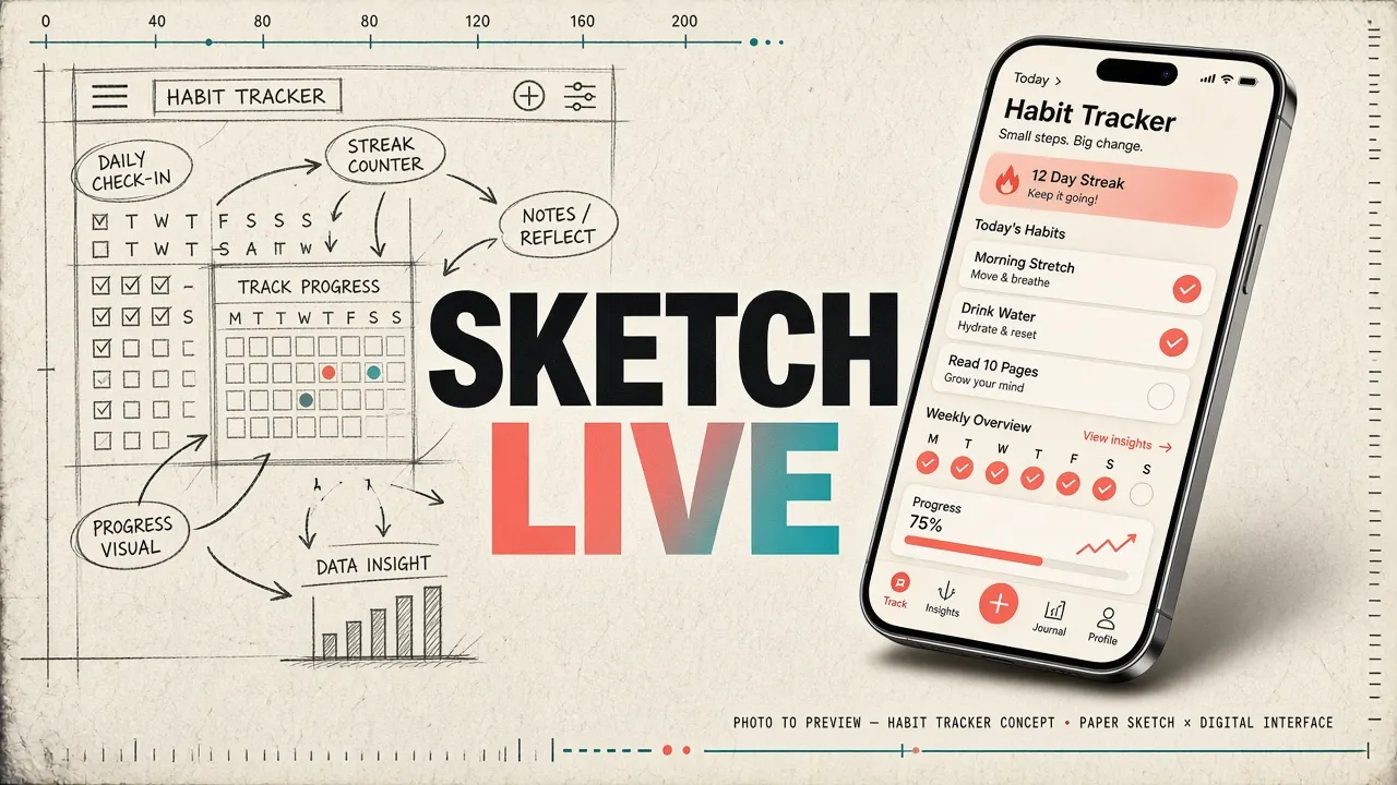
Meta’s Muse app can now turn a short description into a living screen inside the app.

I keep half-finished lists in my notes app. A gift list. A trip checklist. A page of client deadlines.
None of them quite deserve their own app. But they also get lost in a long file of notes.
On 6 November 2026, Meta showed a different path in its Muse app. It is called Spaces.
You describe an idea. Muse builds a screen for it, inside the app you already use.
You start with a sentence
A space is a custom experience you create in Muse. The examples in Meta’s post are simple. A holiday gift tracker. A daily word game. A planning board for a DIY project.
Your first description is only a starting point. You can keep talking to Muse as you use the space. You can add what is missing, try a new look, or change how it works.

You also choose where the space lives. You can add it to the sidebar, move it into the main tabs, or hide it when you do not need it. You can even schedule when it appears.
Get Design Nomad’s stories in your inbox
Join Medium for free to get updates from this writer.
Meta gives a clear example. Keep your weekly planner up front during the workweek. Then swap it for your weekend plans on Saturday.
It stays with you
The space becomes part of Muse. You can come back to it at any time.
If you connect the apps you already use, the space can update itself in the background. New concert dates, price changes or savings progress can show up without you asking.
You can check things off, add notes and make edits right in the space. Those changes stay there when you return.
Meta lists other uses too. A shopping hub. A school dashboard. A music tracker. A wedding planner. A trip planner. Even a client hub for freelance work.
Sharing with other people is not ready yet. Meta says it is still exploring that.

What this means for designers
For years, a personal tool meant a new app, or a messy notes file.
Spaces sit in the middle. The person describes a job. A screen is built for that job. Then it can be pinned, hidden or timed, like any other part of the product.
That is a new design problem. We are no longer only designing one layout for everyone. We are designing a system that can make many small layouts, and a home for them inside the app.
I would still want to know how clear the first version is, and how easy it is to undo a change. But the idea itself is calm and useful. The screen should fit the person’s day, not the other way around.
Have you ever wished a product could grow a screen just for your routine? What would you ask it to build first?