How I Built Native Glass Tab Bars for React Native — iOS 26 Liquid Glass + Android Floating Pill in One Component


Every React Native team I’ve worked with hits the same wall eventually.
You want your tab bar to feel native. Really native. Not a JavaScript-rendered approximation of native (the actual thing)
- Liquid glass on iOS 26.
- A GPU-blurred floating pill on Android like Telegram.
- Material 3 tabs when you want the standard look.
The problem is that achieving all of this traditionally means maintaining three or four completely separate implementations, each with its own Platform.OS checks, its own fallback logic, and its own bugs.
So I built react-native-glass-tabs — a single <GlassTabs> component that handles everything, on every platform, with one API.
The Problem With Existing Solutions
Before building this, I looked at what was already out there.
@react-navigation/bottom-tabs is the default choice for most teams. It's solid, well-maintained, and covers the basics. But it has no liquid glass, no GPU blur, and no floating pill style. You get a flat JavaScript-rendered tab bar regardless of what platform you're on.
react-native-bottom-tabs gets closer — it supports liquid glass on iOS 26. But it doesn't support GPU-accelerated blur on Android, and it doesn't offer a floating pill layout.
Neither gives you a single, unified API that adapts intelligently to every platform and OS version.
That’s the gap react-native-glass-tabs fills.
What It Does
iOS 26+ — Native Liquid Glass
On iOS 26 and above, the component uses SwiftUI’s TabView under the hood via @bottom-tabs/react-navigation. You get the full native liquid glass effect — the frosted, translucent tab bar that Apple introduced as the new design language.
SF Symbols are rendered natively. The search tab role activates iOS's native search tab appearance. Headers are transparent with native blur by default, so content scrolls behind them naturally. You don't have to configure any of this — it just works.
iOS 18 and Below — Graceful Fallback
On older iOS, the component automatically falls back to @react-navigation/bottom-tabs with a standard UITabBarController. Same API, different rendering. Your app doesn't break, it just adapts.
Android API 31+ — GPU-Blurred Floating Pill
On Android API 31 and above, the floating pill is powered by a custom native Kotlin module built directly into this package — no third-party blur library, no external dependency. It applies RenderEffect.createBlurEffect() directly to the tab bar background, giving you GPU-accelerated frosted glass that updates in real time as content scrolls beneath it.
This is the same technique Telegram uses for its floating tab bar, and it’s entirely self-contained within react-native-glass-tabs. You don't need to install or configure anything extra to get it.
On older Android versions, it falls back gracefully to a semi-transparent pill with an elevation shadow — still looks great, just without the blur.
Android — Material 3 Native Tabs
When you want the standard Android look instead of the floating pill, set floating={false}. This switches to the native Material 3 BottomNavigationView via @bottom-tabs/react-navigation. Pass nativeIcon with filled and outline image sources and you get fully native Material 3 tab rendering.
Installation
npm install react-native-glass-tabsThen install the required peer dependencies:
npm install @react-navigation/native @react-navigation/bottom-tabs react-native-screens react-native-safe-area-contextFor Android, update your styles.xml to use a Material 3 theme:
<style name="AppTheme" parent="Theme.Material3.DayNight.NoActionBar">
</style>
Works with Expo using a development build (expo prebuild) for the native Android blur module.
Basic Usage
The simplest possible setup — one component, adaptive everywhere:
import React from 'react';
import { NavigationContainer } from '@react-navigation/native';
import { GlassTabs } from 'react-native-glass-tabs';
import Icon from 'react-native-vector-icons/Ionicons';
const App = () => (
<NavigationContainer>
<GlassTabs
tabs={[
{
name: 'Home',
component: HomeScreen,
title: 'Home',
renderIcon: ({ color, size, focused }) => (
<Icon name={focused ? 'home' : 'home-outline'} size={size} color={color} />
),
},
{
name: 'Search',
component: SearchScreen,
title: 'Search',
role: 'search',
renderIcon: ({ color, size, focused }) => (
<Icon name={focused ? 'search' : 'search-outline'} size={size} color={color} />
),
},
]}
primaryColor="#007AFF"
/>
</NavigationContainer>
);That’s it. No Platform.OS checks. No conditional rendering. One component, one API.
Platform-Specific Icons
For the best native experience, you can provide platform-specific icons using PlatformIcons:
sfSymbol— typed SF Symbol name for iOS 26+ liquid glass, rendered natively by SwiftUInativeIcon— filled and outline image sources for Android Material 3 tabsrender— a render function for JavaScript-rendered tabs (floating pill on Android, iOS fallback)
import { Platform } from 'react-native';
import Ionicons from 'react-native-vector-icons/Ionicons';
const createNativeIcon = (filled: string, outline: string) => {
if (Platform.OS !== 'android') return undefined;
return {
filled: Ionicons.getImageSourceSync(filled, 24, '#000000'),
outline: Ionicons.getImageSourceSync(outline, 24, '#000000'),
};
};<GlassTabs
tabs={[
{
name: 'Home',
component: HomeScreen,
title: 'Home',
renderIcon: {
sfSymbol: 'house.fill',
nativeIcon: createNativeIcon('home', 'home-outline'),
render: ({ color, size, focused }) => (
<Ionicons name={focused ? 'home' : 'home-outline'} size={size} color={color} />
),
},
},
]}
primaryColor="#007AFF"
/>
The component automatically picks the right icon source for each platform and configuration. On iOS 26+, sfSymbol is always used regardless of the floating prop. On iOS below 26, the render function handles both modes. On Android, render is used for the floating pill and nativeIcon is used when floating={false} for native Material 3 tabs.
Key Props
The component has a clean, focused API. Here are the ones you’ll use most:
Get Louay Sleman’s stories in your inbox
Join Medium for free to get updates from this writer.
tabs (required) — array of tab configurations, each with a name, component, title, and icon.
primaryColor — active tab tint color, defaults to #007AFF.
floating — set to true for the GPU-blurred floating pill on Android (default), or false for native Material 3 tabs.
labeled — show or hide text labels, defaults to true.
hapticFeedback — iOS haptic feedback on tab press, defaults to true.
colorScheme — accepts 'light', 'dark', or 'auto' to follow the system (default).
blurRadius — controls the Android blur intensity in pixels for API 31+, defaults to 25.
minimizeBehavior — controls tab bar minimize behavior on iOS 26+, accepts 'automatic', 'onScrollDown', 'onScrollUp', or 'never'.
Header Configuration
Headers are included out of the box with sensible platform defaults. On iOS 26+ with liquid glass, headers are transparent with native blur automatically — content scrolls behind them the way Apple intends.
You can configure headers per tab:
// No header
{ name: 'Profile', header: false, ... }
// Header with a right button
{
name: 'Home',
header: {
right: () => (
<TouchableOpacity onPress={openSettings}>
<Ionicons name="settings-outline" size={22} color="#007AFF" />
</TouchableOpacity>
),
},
...
}// Large title that collapses on scroll (iOS)
{ name: 'Feed', header: { largeTitle: true }, ... }
How the Android Blur Actually Works
The GPU blur on Android is worth explaining because it’s genuinely different from most approaches — and importantly, it’s built entirely in-house.
Most React Native blur implementations either rely on a third-party library or use a JavaScript-based snapshot approach — they take a screenshot of the content behind the blurred element and apply a software blur filter to it. This is slow, doesn’t update in real time as content scrolls, and doesn’t look right.
The floating pill in react-native-glass-tabs uses none of that. The blur is implemented in a custom native Kotlin module that lives inside this package — no additional dependency, no extra install step. It calls RenderEffect.createBlurEffect() directly, which is a native Android GPU API introduced in API 31. This runs on the GPU, updates in real time as you scroll, and produces the same quality blur you see in Telegram or other first-class Android apps. It's applied to the actual composited view, not a snapshot.
The result is a self-contained implementation. One package install, and the native blur is there — no configuration, no third-party setup, no surprises.
On devices below API 31, the component falls back to a semi-transparent background with elevation shadow. Still a floating pill, just without the blur layer.
Badges, Haptics, and Dark Mode
These come built in, not bolted on.
Badges are configured per tab:
{
  name: 'Chat',
  badge: 12,  // number or string
  ...
}
Haptic feedback fires on tab press on iOS automatically. Set hapticFeedback={false} to disable it.
Dark mode follows the system by default (colorScheme="auto"). Force a specific mode with colorScheme="dark" or colorScheme="light".
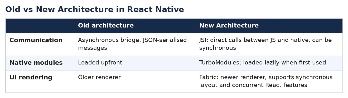
New Architecture Support
The package includes codegenConfig and is fully compatible with both the old and new React Native architectures. Fabric and TurboModules are supported out of the box. No extra configuration needed.
Comparison With Alternatives
react-native-glass-tabs is the only option that covers the full stack: liquid glass on iOS 26, a GPU-blurred floating pill on Android built natively in-house without any third-party blur dependency, a single unified API across all platforms, and graceful fallbacks at every OS version. Haptics are built in.
@react-navigation/bottom-tabs is the standard choice and handles badges well, but has no glass effects, no blur, and no floating pill. You get the same flat tab bar on every platform.
react-native-bottom-tabs adds liquid glass on iOS 26, which is a step forward. But it has no GPU blur on Android, no floating pill layout, and the Android pill requires external dependencies — it’s not self-contained.
Why This Matters
The tab bar is the first UI element users interact with in most apps. It’s persistent, it’s visible on every screen, and it shapes the overall feel of the product in a way that most UI elements don’t.
When the tab bar feels native — when it has real glass blur, real haptics, real SF Symbols — users notice. Not consciously. They can’t name what’s different. But the app feels more polished, more considered, more worth using.
That’s the case for investing in this kind of detail. And the reason I built this as a single component with one API is that it should require zero extra investment. Drop it in, pass your tabs, and it handles everything else.
Getting Started
npm install react-native-glass-tabs @react-navigation/native @react-navigation/bottom-tabs react-native-screens react-native-safe-area-contextFull documentation, props reference, and example app:
- GitHub: https://github.com/louaySleman/react-native-glass-tabs
- npm: https://www.npmjs.com/package/react-native-glass-tabs
- Example app: https://github.com/louaySleman/react-native-glass-tabs/tree/main/example
MIT licensed. Issues and PRs welcome.
If this saves you a sprint, a star on GitHub goes a long way.